In Chapter
7, page XX, I created masks using
channels and the Channel Mixer to exploit color differences between B&W
photographs and the damage inflicted on them. I took advantage of colors or
combinations of colors that especially emphasized the damage over the
photograph.
Those same
tricks can be inverted to minimize the damage, using complementary colors. For
example, damage that is especially visible in the green channel will have a
strong magenta component. That means it will not be very visible in the
“magenta” (red + blue) channel. I would use the green channel to build a mask
from because it shows the damage so clearly. Conversely, if I wanted to suppress
that damage, I would use the Channel Mixer to combine the red and blue channels
and exclude the green channel.
I used the
colors green and magenta merely as examples. The precise color that works best
will depend on the photograph and the damage. If the damage looks reddish
compared to the photograph, check out the red channel; if it looks cyan, then
check out the green and blue channels. What you can usually count on when
restoring a B&W photograph is that one channel will show the damage and
stains on the photograph less than the other channels.
That’s
especially true when you’ve done a good scan that produces a reasonably
neutral-toned photograph. Stains and other defects usually have a different
color from the photograph proper. Once you’ve finished with the kinds of repairs
that require a full-color image (like the tarnish-reducing work I did in the
previous section), look at the individual color channels for the photograph and
select the one that looks the cleanest for further restoration
work.
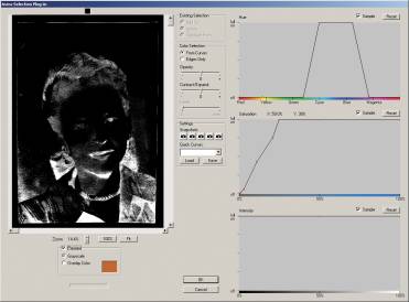
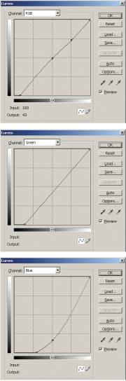
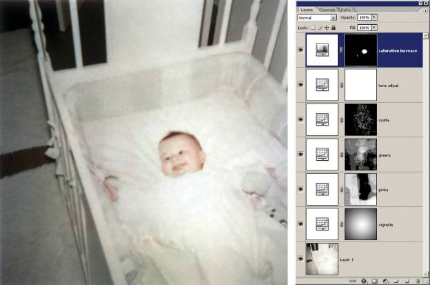
In the
portrait in Figure 8-47 the stains are yellow-orange in color. When I inspected
each color channel, I saw that the red channel displayed hardly any of the
stains. I copied that channel into a new file that is shown in the middle column
of Figure 8-47. I used the Clone tool to clear out the white marks of the top
and remove a couple of small dark spots from the picture; it literally took just
a few minutes work to make it look this good.
Dealing with Textured Prints
Paper
texture isn’t really damage, because it was an intentional part of the original
print. Print textures, though, usually look bad when they are reproduced on a
flat-finish paper. If you want to restore an original, textured photograph to a
fresh textured print, you will get a much better-looking print if you print a
clean image on textured paper than if you try to print the illusion of texture.
Consequently, I treat texture as if it were widespread damage—something I want
to erase from the prints while doing as little destruction of photographic
detail as possible.
Like tarnish
and other surface blemishes, texture tends to get enhanced in scans. I talked in
Chapter 4, Getting the Photo into the Computer, about rephotographing textured
prints on a copy stand as one way to get around the paper texture problem. Here,
I deal with getting rid of paper texture in scans.
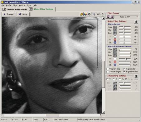
The print in
Figure 8-47 cleaned up nicely with the tarnish mask. To get rid of its texture I
pulled up Neat Image, a very powerful noise reduction plug-in (see Chapter 3,
Software for Restoration). Neat Image profiled a section of the background and
created a filter that could cancel out the texture just as if it were noise
(Figure 8-50). The filter was so effective that it completely eliminated the
paper texture at its default settings, but it also softened the finest detail in
the photograph. |